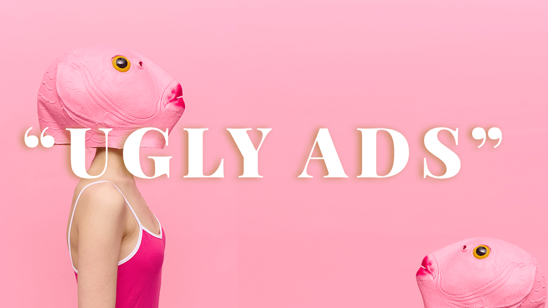
18 Mar Ugly Ads: Why Imperfection Might Be Your Marketing Superpower
Why Ugly Ads Are Winning in 2025
In a world obsessed with perfection — flawless Instagram feeds, polished ad campaigns, and sleek branding — something unexpected is breaking through the noise: ugly ads.
Yes, you read that right. These raw, unpolished, sometimes downright chaotic ads are stopping the scroll and driving results. But why? It turns out that imperfection feels real — and in a marketplace drowning in perfection, real is refreshing.
Let’s break down why “ugly ads” work — and how you can harness their power to drive more clicks, conversions, and customer trust.
What Exactly Are “Ugly Ads”?
Forget the glossy, professionally designed visuals you’re used to. “Ugly ads” break the rules — on purpose. They rely on a raw, imperfect aesthetic that feels real and authentic. Think:
- Unconventional Fonts – Clashing styles, handwritten scribbles, or pixelated text.
- Raw Images – Screenshots, rough sketches, and unedited photos.
- Clashing Colors – Loud, mismatched color palettes that grab attention.
- Messy Layouts – Designs that look “thrown together” — but still communicate the message clearly.
The goal isn’t to make it look good — it’s to make it stand out and feel human.
Why “Ugly Ads” Work (Even When They Shouldn’t)
1. They Stop the Scroll
Most ads blend together. Same polished designs, same color schemes, same stock images. Ugly ads disrupt that pattern, forcing people to stop and pay attention.
When everyone zigs, you zag. Ugly ads create contrast — and contrast creates curiosity.
2. They Feel Real (and Real Builds Trust)
Audiences are tired of overly produced, unrealistic content. When people see a rough, imperfect ad, it feels authentic — like it came from a real person rather than a corporate machine.
People trust people — not perfection.
3. The Message Comes First
With ugly ads, the design takes a back seat to the message. When the message is direct and clear, it’s easier to connect with your audience and drive action.
Clarity beats beauty every time.
4. They Trigger Curiosity
An ugly ad makes people pause and think: “Is this real?” or “Why does this look so different?” That moment of confusion triggers engagement — which is exactly what you want.
Curiosity leads to clicks.
How to Create a Smart “Ugly Ad” Strategy
1. Know Your Audience
“Ugly” only works if it resonates with your target market. A casual, unpolished look might work for direct-to-consumer brands, but not for luxury products or high-end services.
2. Keep the Message Crystal Clear
Ugly ads work because they strip away fluff and focus on the message. Make sure your headline and call-to-action (CTA) are impossible to miss.
3. A/B Test Ruthlessly
Not every ugly ad will hit the mark. Test different fonts, colors, layouts, and messaging. Track the data and let performance guide your strategy.
4. Don’t Sacrifice Functionality
An ugly ad still needs to work. Make sure your CTA is clear, the link works, and the message drives action.
5. Keep It Authentic
If it feels forced, it won’t work. Ugly ads succeed when they feel real — not like a marketing stunt.
Final Thoughts: Embrace the Ugly
Ugly ads are proof that you don’t need perfection to succeed — you need authenticity. People are drawn to what feels real, even if it’s a little messy.
If you’re ready to rethink your ad strategy, Life In Motion Marketing can help. We offer free consultations to assess your current strategy and find ways to boost your results.
Click here to schedule your consultation today!
Ugly might just be the best thing to happen to your marketing.